Encamp is a data platform. In conversations with customers, we’ve uncovered that there are specific use cases for how data must be organized that are critically important to them. We never want design to be an inhibitor to how information is accessed, so having a flexible data grid is a must. A data grid is a structured way to display and organize large amounts of information in rows and columns, often as a data table. It’s the best way to present data efficiently, especially when Encamp users need to quickly compare values, sort by date, or view data sets down to the facility level.
In Q2, we made significant improvements to our data grid led by Encamp’s UX Designer, Brianna Eng. Brianna’s design philosophy is simple: To create tools that are truly informed and shaped by those who need them.
“Encamp’s customers depend on accurate data to ensure that they are able to meet reporting obligations and do their work effectively. When they enter Encamp’s app, I want them to always be able to access the information they need, easily and clearly.”
Recent data grid improvements include:
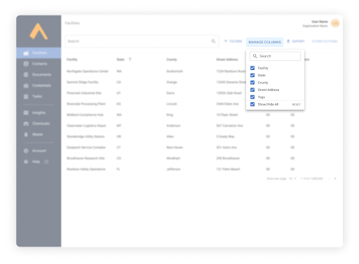
More accessible Manage Columns menu
Some data grids need to host immense amounts of information. The design solution to this is to add many columns which can be leveraged to sort and organize the data. At Encamp, we want users to be able to customize their data grids to meet their specific use cases. Giving our users the ability to Manage Columns allows them to sort or even minimize columns that aren’t relevant for their particular goals.
Previously, Manage Columns was hidden under the 3 dot menu in each column header. Now it’s also a top-level button so users can easily modify how the data grid appears.
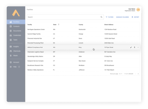
Reduced visual noise with row hover
Actions buttons (edit, delete, etc) used to appear persistently on each row. Brianna decided to reduce visual noise by making these actions appear only on-hover. Actions don’t appear until they’re needed so users can more easily focus on their data.
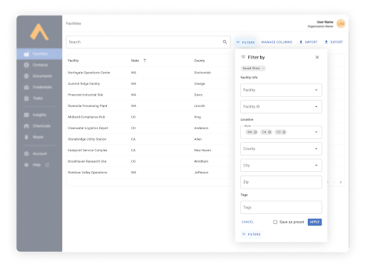
Saving filter preferences
Oftentimes, users need to view their data in different segments or data sets. Filters make that possible. Encamp users can now save frequently used filters, making it quick and easy to have bespoke datasets at your fingertips.
With usability at the forefront of our platform, these updates are just one example of how we’re making complex environmental compliance simpler, clearer, and more intuitive. Brianna assures that Encamp’s UX design avoids a “one-size-fits-all” approach.
“We’re making an effort to think through different use cases and workflows and designing for a range of user needs.”
By listening to our users and investing in thoughtful UX design, we’re ensuring that Encamp not only delivers the data our customers need, but does so in a way that supports the way they work.
👉 If you’re an Encamp customer, log into your account to check out the latest UX enhancements to Encamp’s data grid.
💬 Not using Encamp yet? Discover how our platform automates environmental compliance and ensures reporting is accurate, transparent, and defensible. Request a demo to learn more.